

FROM FARM TO BOWL
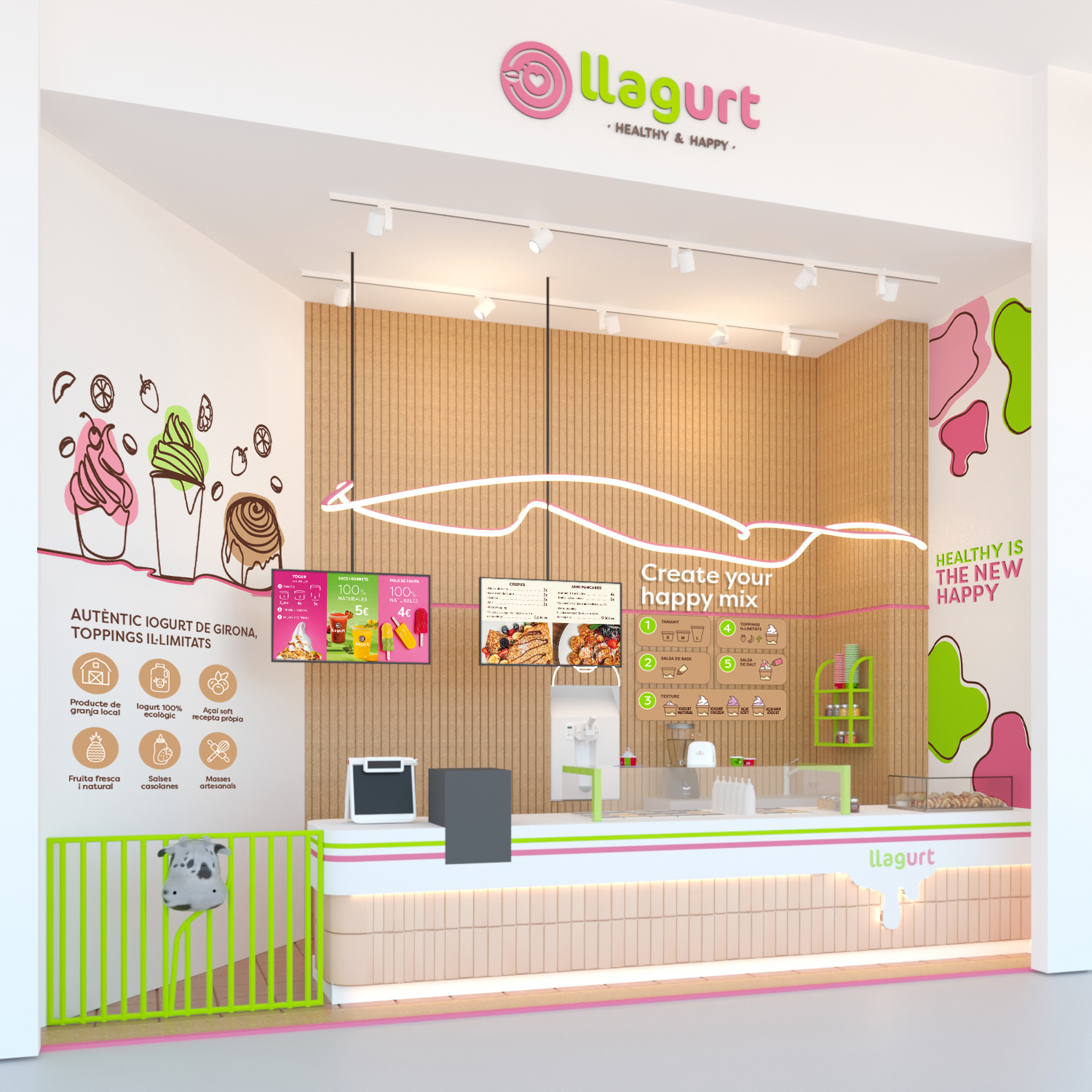
The in-store communication was developed around a farm concept, bringing the origin of the product into the space itself. Fence-inspired elements, a playful cow, hand-drawn illustrations of fruit, cups and toppings, and a warm natural palette reinforce the brand's promise of authentic, locally sourced yogurt, while the pink and green keep the atmosphere fresh and fun. The wall menu was designed to communicate unlimited toppings and the freedom to customize, guiding customers through a simple step-by-step "Create your happy mix" experience, from choosing size and base sauce to texture and toppings. Icons and claims on the wall highlight the brand's natural credentials, such as local farm produce, 100% organic yogurt, and homemade sauces, turning the point of sale into a clear and engaging expression of the brand.
COLOR-CODED PRODUCT PHOTOGRAPHY
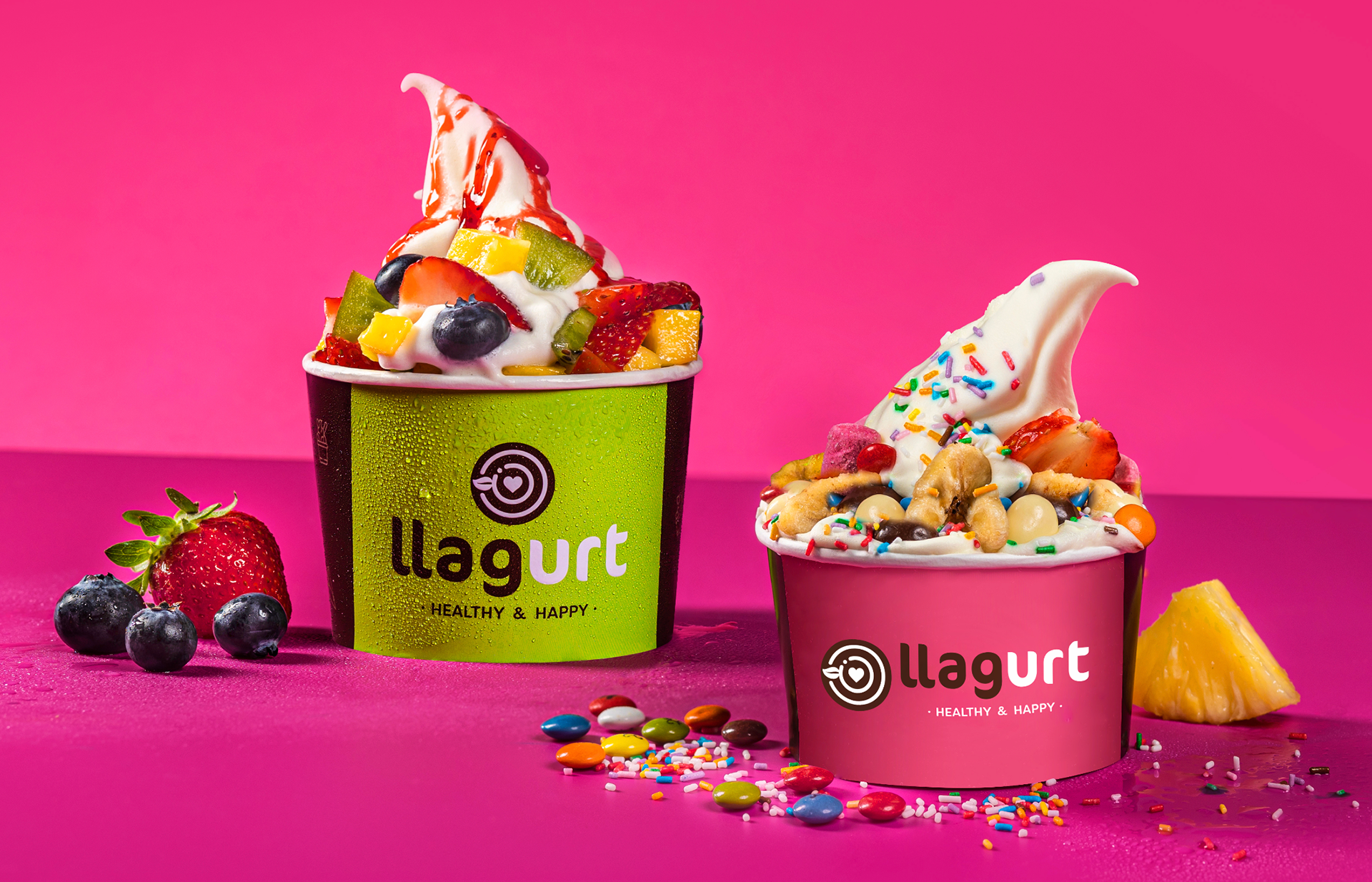
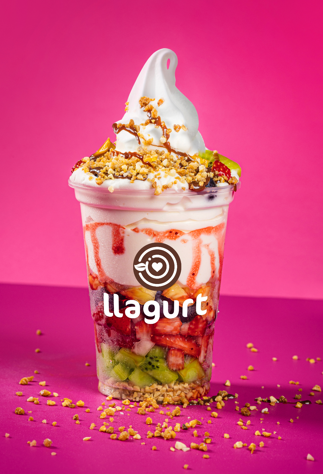
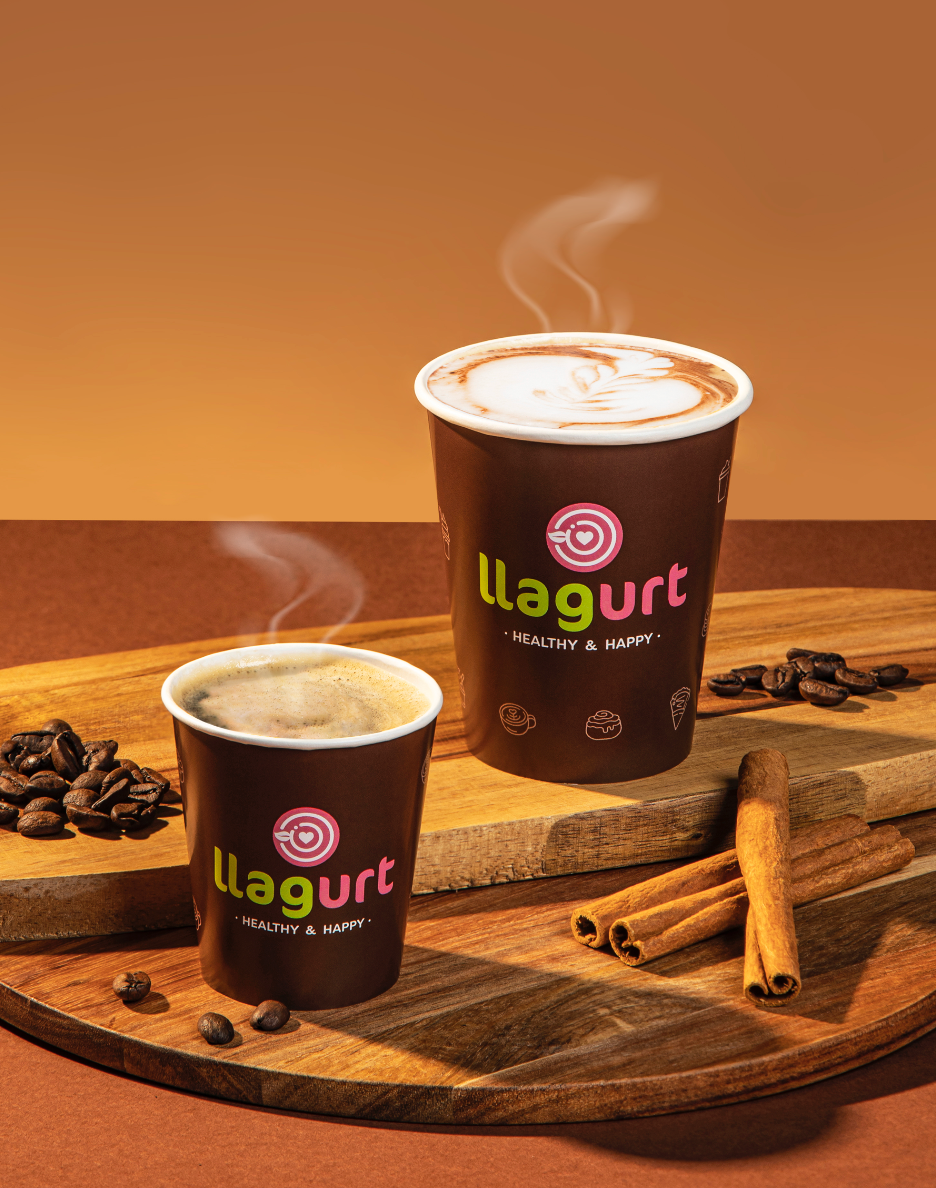
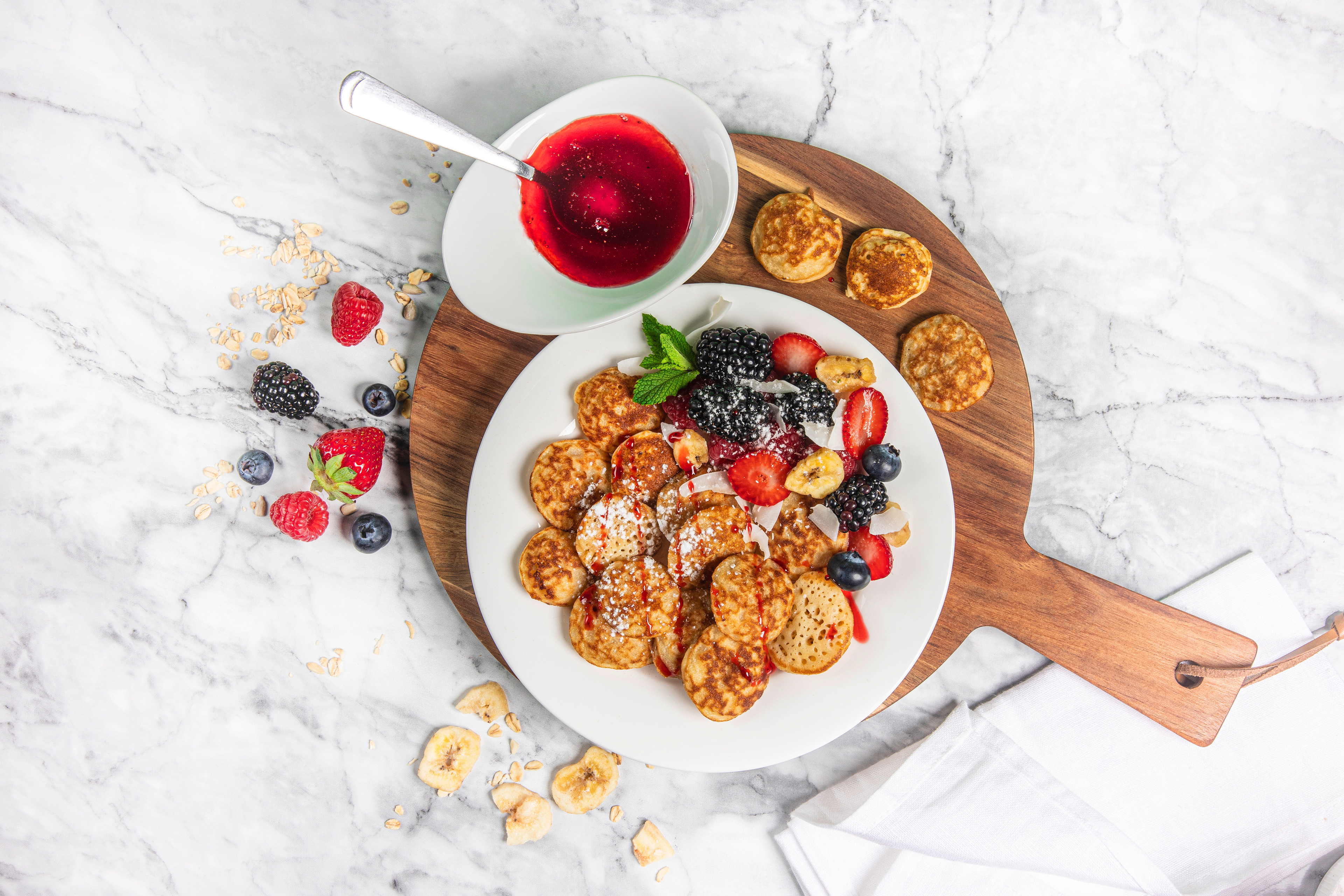
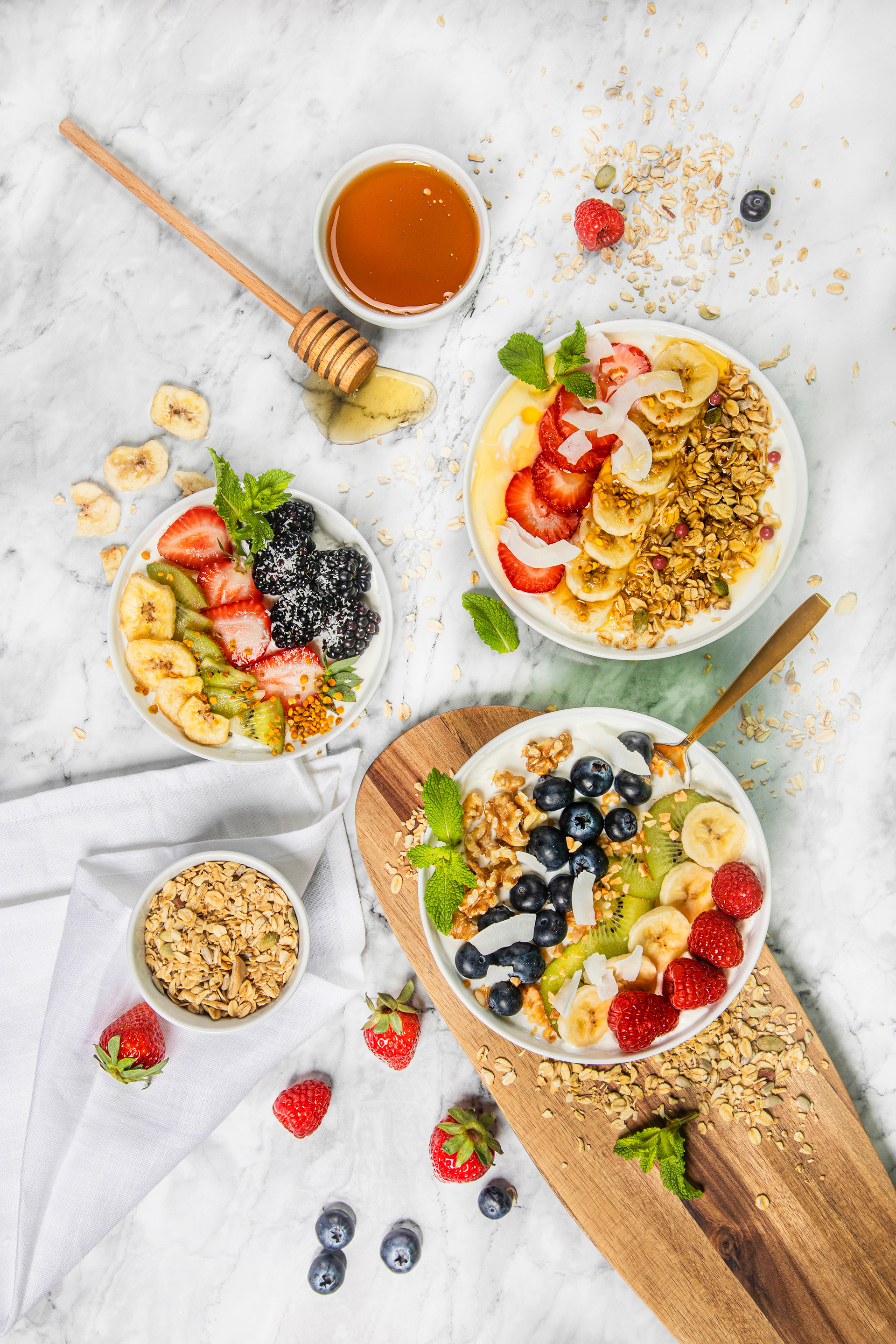
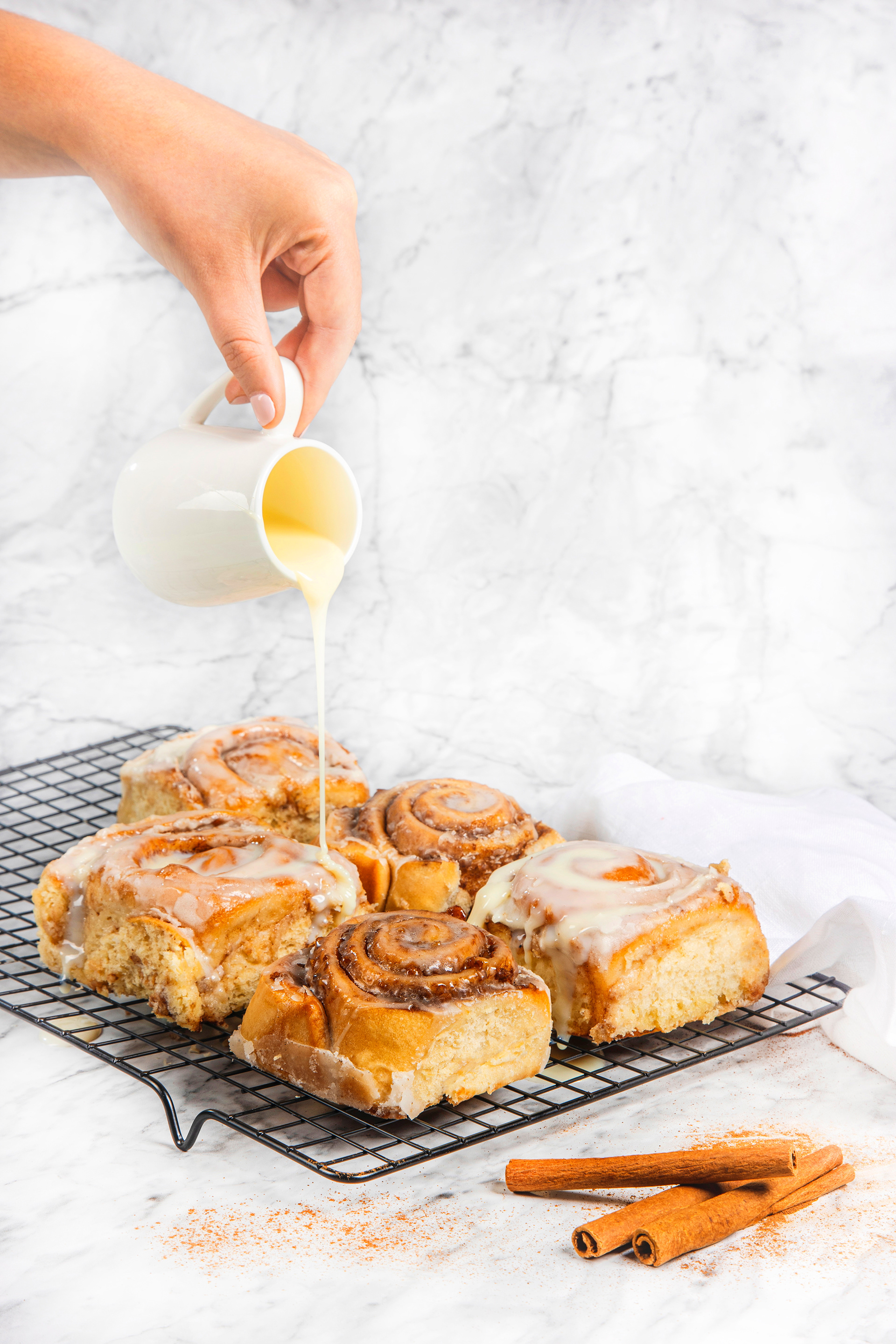
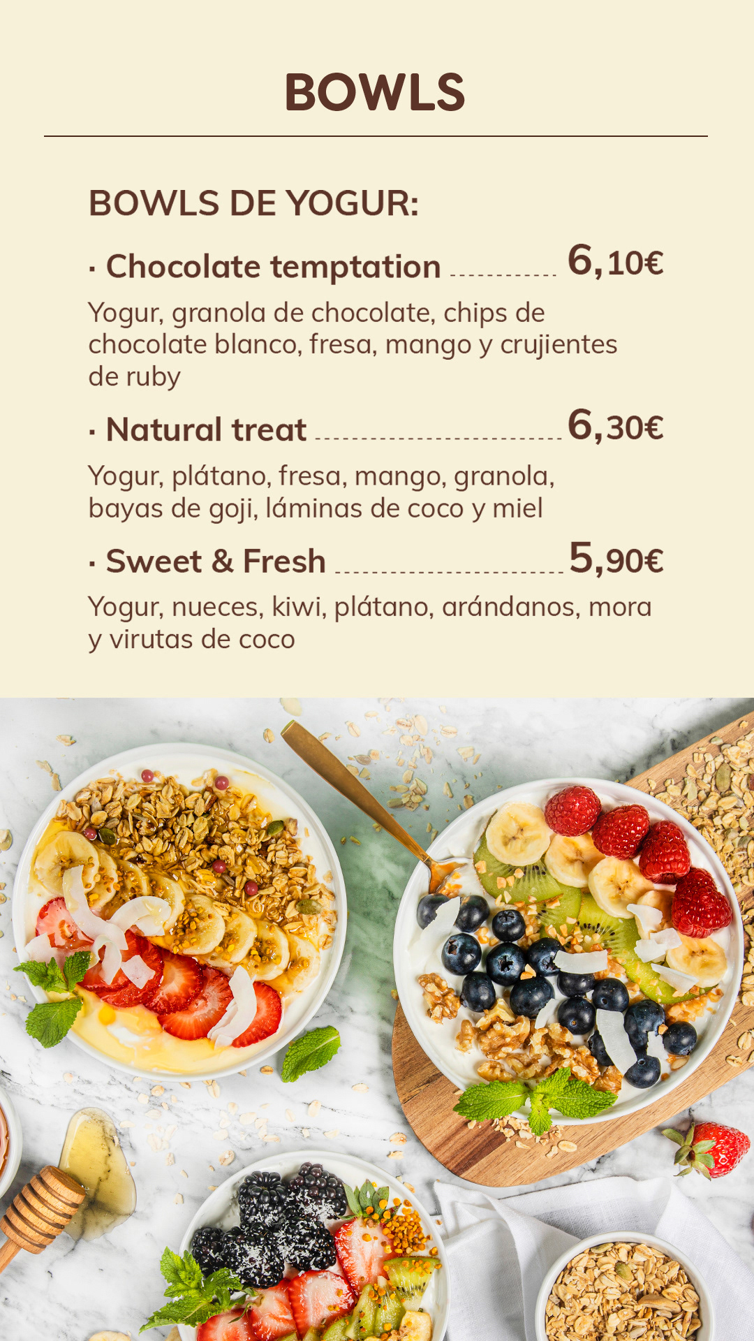
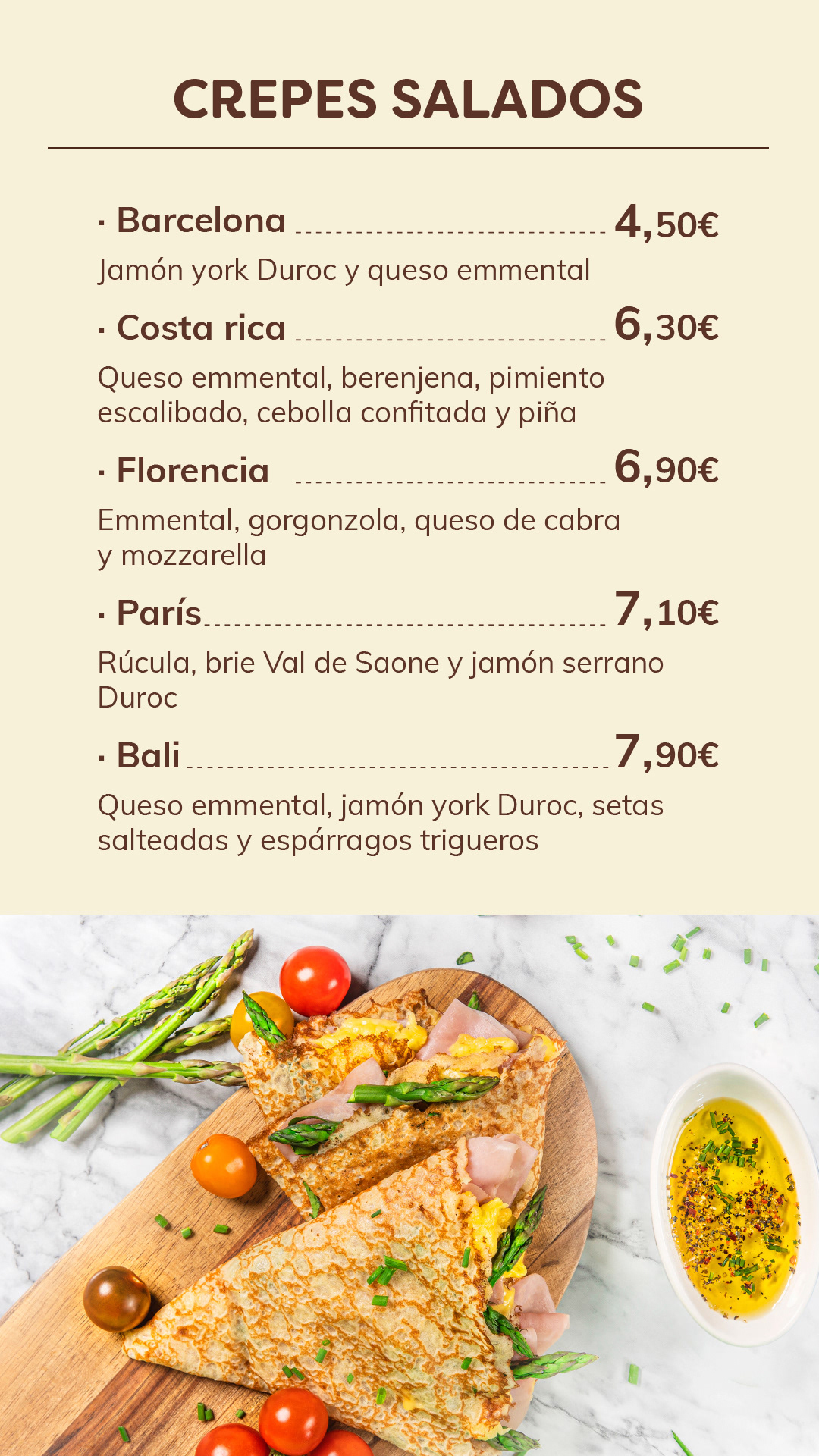
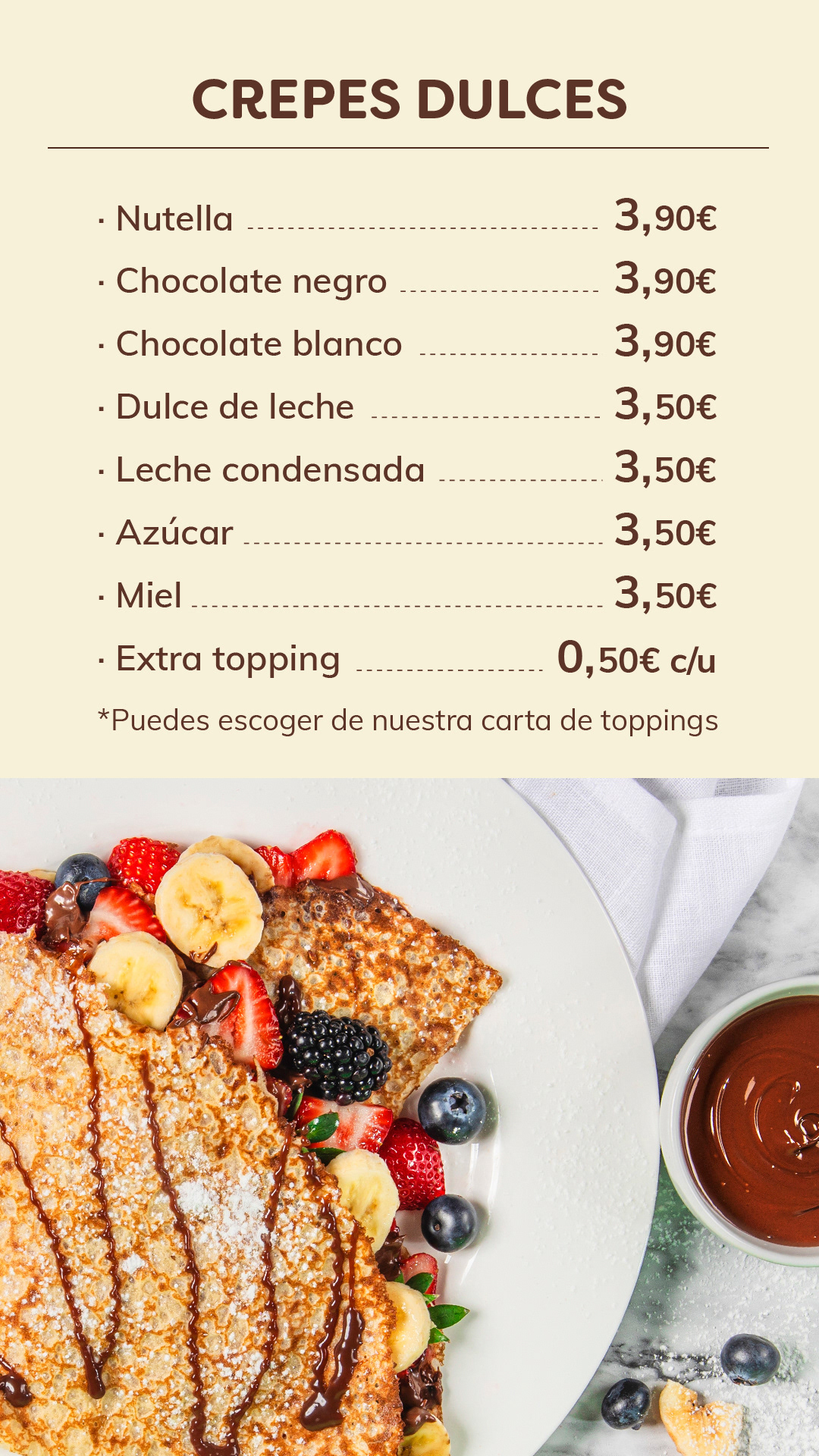
I directed the product photography following a color-coded system that translates the brand's personality into every image. Fuchsia backgrounds are used for the more playful, customizable products, bringing out the fun and indulgent side of the brand. Green backgrounds highlight the healthiest options, reinforcing freshness and natural ingredients. For the warmer offering, such as coffee, pastries, and sweet and savory crepes, I used brown, cream and marble backgrounds, creating a cozy, comforting atmosphere that contrasts with the brighter cold range. This approach gives the brand a consistent and instantly recognizable visual language, helping customers identify the type of product at a glance across menus, social media and point of sale.